

Stocks, Bonds and the Yield Curve
Part 2

In Part 1 I promised that I would “go deeper into the current absolute levels of government bonds, the Yield Curve, S&P Sectors and how to construct stock portfolios for every kind of bond market environment.”, so here goes…
Are yields on US Treasuries high? No. Neither in nominal nor in real terms. They are historically low, in both terms. They are higher than they were. But where they “were” was pricing in a pretty catastrophic situation which, quite simply, did not come to pass. Covid19 was not the end-of-the-world-as-we-know-it. The odds of that happening were always close to zero (see my previous posts about the Covid19 panic, not to say hoax).
Below is a weekly chart of $TLT (20+ Year UST ETF). You can see that we are currently lower in yield than at the height of the Lehman Crisis in late 2008 and at the same level as before the Pandemic Panic of February 2020. The market has simply, and only, returned to where it was and still far below average yields for the past decade.

But what changed in 2021 and specifically in February, was the rate of change of the adjustment. Below is a daily chart of the 30yr UST yield.

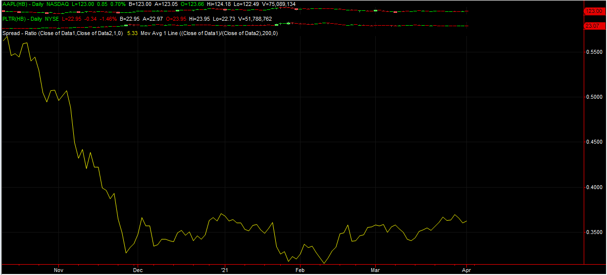
You can notice the acceleration of the adjustment in yield starting in mid-February. In 11 trading days we rose 50bps, which is a 25% move in 30yr yield. The 2s-10s steepened from 108bps to 140bbs in the same period. What all this caused was a rapid reassessment of what the appropriate long term risk-free discount rate was for equities. And this was bound to affect more individual stocks without current earnings (currently loss-making “technological disruptors” with positive earnings into the far future) than stocks with solid current earnings and even solid growth prospects. You can have a look at a relative spread chart even within the technology space: a solid currently profitable company like $AAPL and one with great prospects of much faster future growth than $AAPL, but currently loss making, say $PLTR: during the same 11-day period in mid-February that the bonds accelerated upwards, the spread went from 0.31 to 0. 36, a nearly 20% move in favour of $AAPL.
If one looks at a basket of such companies inside an ETF specializing in future disruptors with extremely limited current earnings, like $ARKK, and compare it to the sector that benefits most from a steepening yield curve, $XLF, you get a 50% move in favour of $XLF in the same period.

And no, I am not picking on $ARKK or Ms. Woods: it has nothing to do with her and everything to do with the bond market. Sudden bond repricing like February’s were bound to cause that kind of disruption to the share price of the companies in that ETF. But if you believe the long-term story of those stocks, they will grow into their projected earnings and this represents a buying opportunity at much lower cost and risk. Unless you think yields will rise much further.
The yield curve is an exceptionally good indicator of the dangers which are potentially ahead for the individual tenures. Various pairs like the 2s-30s, 2s-10s, 5s-30s, 10-30s, etc. tend to trade within technical ranges for much of the time and each is telling a story and painting an overall picture. When they break out of those ranges, it indicates where the market pressure is coming in. Below is a chart of the yield curve shift Jan1-March22 2021 and it is quite dramatic.

It is obvious that the curve pivoted around the 2–3-year area, giving you the following narrative: the Fed is on hold for the foreseeable future, despite growing signs of inflationary pressure and strong economic growth ahead, because of the reopening and the massive stimulus package. Issuance will be massive going forward and we need a give-up as some safety cushion in case we run out of buyers…if the Fed is not prepared to tighten to control future implied inflation.
That that was the danger ahead (of abrupt steepening), was obvious from December 2020, when the 2s-30s started trading above the previous lows around the 1.40-45% yield from August 2016 and June 2017.
On the other hand, if we look at a longer-term chart, we see that we stopped steepening at the July 2012 lows. In absolute terms, we are nowhere near out of a normal situation in the yield curve, we have only mean reverted. Now, should we take out the Q4 2011 lows and highs of July 2015 of 2.57%, I can guarantee an acceleration towards 3.50% and another very nasty episode in growth stocks, as the stock market readjusts discount factors and multipliers. A 2s-30s curve beyond 2.57% would flash red for growth stocks.

But there is another part of the curve which currently is saying that that is unlikely to happen: the 10s-30s: it has been flattening abruptly the past couple of weeks and is now at the same levels as in April 2020 at around 64bps. This indicates that the market is regaining confidence that the Fed is right in their assessments and that inflation will be transitory. Since its low on March 21st at 85bps we have narrowed over 20bps, pivoting around the 5s and 10s. The narrative now is that we can look through the next few months of inflationary pressures as the market believes that the Fed will tighten/remove stimulus in 2023-24 and remove excess inflationary pressure above 2% nominal. In other words: the market tends to believe that there will be no runaway inflation and that the Fed is in control.

It is no coincidence that in the past month the tech heavy Nasdaq has found a low, resisted every attempt to drive it lower and finally busted through 13,312 resistance. Easily forecastable by anyone following the behaviour of 10s-30s. I can guarantee that if they fall back through 85bps, the Nasdaq will get massacred again, if nothing else on a spread to the Dow Jones.
A lot of people will now comment: “I have seen a lot of periods when higher bond rates led to higher equity prices!” Of course. It’s called Risk On. You can follow its interplay daily on www.riskdials.com. Rates and the curve have different effects at different times on individual equities. Much depends on the starting position and why the yield curve is doing what it is doing. Most of the time, Risk On is as a result of a steadily expanding economy which is gradually accelerating. As the economy gathers steam, analysts increase forward earnings and money flows out of fixed income into stocks. Which stocks and at what time depends on the movement of the yield curve and the absolute level of rates. This Quarter has been almost textbook:
The leaders have been: Energy, Financials & Industrials (reopening economy demand for energy; steeper yield curve, higher lending spreads and fewer non-preforming loans; reopening of manufacturing & demand after stimulus). The laggards Utilities, Staples & Technology (higher bond yields for all three.)
You can think of the Sectors as a group of mountaineers trying to ascend Everest at the same time but walking along different paths or on differing stages of the ascent. You can think of bond yields as the wind and of the yield curve as sudden snowstorms. The higher the absolute level of real yields, the stronger the intensity of the constant wind. And a steep curve (and especially when tenure pairs break important levels) as a very sudden and incredibly strong blizzard that forces one to retreat. Depending on where each individual mountaineer is on the climb, he will be affected differently by these weather events. If you are on a steep rockface a blizzard can be extremely dangerous, but if you are on a sheltered flatter slope, the same weather event will affect you far less, if at all.
Just as any seasoned mountaineer would not neglect to look at a weather forecast, neglecting to listen to what the yield curve is currently saying can be fatal in stock market investing. That is precisely why I start every weekly review video on http://www.charityhedgefund.com/weekly-video with the yield curve and bond market triggers. Investing is playing the odds. Betting against the yield curve is very high risk and low reward in the long term.
I will leave you with this excellent animation of the yield curve through time, produced by the Federal Reserve, asking the rhetorical question: “Is the Yield Curve Really That Steep?”. Each forecast movement is a huge investment opportunity with big rewards!
Nick, thank you for brilliant article. Now it is pretty clear how you look at the rates. Considering 10s-30s and 2s-30s - seems like 2021 year is similiar to 1992 year. While 10s-30s was falling with 30s-02s was rising in 2018 - 2021 - the market was very turbulent. The same happened in 1989-1992. In 1992 reversal of 10s-30s followed by reversal of 2s-30s. Both 1992 and 2021 are 10 years after big commodity cycles - 1970-1980 and 2000-2010.